
Exhibition stand ideas for 12 to 20 m²: more impact on a small space - CA Exhibition Construction
A small exhibition stand doesn't have to feel small. On 12 to 20 square meters, it's not the sheer size that matters, but rather how visitors are guided, the message is clear, and the design is disciplined. Those who fill every square meter with exhibits, text, and furniture often lose precisely what counts at a trade fair: quick orientation and good conversations.
This list presents practical exhibition stand ideas for compact spaces. The focus is on zones for reception, product presentation, discussions, and storage; two specific layout ideas for 12 m² and 20 m²; tips on graphics, lighting, and LEDs; and the question of when modular or hybrid construction makes sense.

1. First, divide the area into four clear zones.
Before planning colors, materials, or graphics, the booth needs a basic layout. Even a small exhibition stand should fulfill four functions:
Reception
Product presentation
Conversation area
Storage or storage space
These zones don't need to be the same size. However, they must be clearly identifiable. In a 12 m² space, a reception desk, a prominent product display, a small standing table, and a lockable cabinet are often sufficient. In a 20 m² space, a semi-enclosed seating area can be added.
A good exhibition stand layout answers three questions:
Where does a visitor stop?
What does he see in the first three seconds?
Where can the conversation take place without blocking access?
For CA Messebau, planning therefore doesn't begin with decoration, but with the stand's logic. Through design and 3D visualization, the impact of pathways, sightlines, and usable areas becomes clear. This is particularly important for small spaces, as mistakes are immediately apparent.
Practical tip: Don't plan the reception area to be too large. A counter with storage space is often sufficient. The remaining open space looks more valuable than a second piece of furniture.
2. For a 12 m² row stand, use a strong back wall.
A 12-square-meter exhibition stand in a row typically has only one open side. This may sound limited, but it can be very effective. The advantage lies in the clear line of sight. Visitors see the stand head-on from the aisle. The concept should utilize precisely this perspective.
A good idea for 12 m² is a three-level layout:
Area | function | Recommendation |
Front area | Reception and first contact | Place the slim counter offset to the side |
Mid-range | Product and brief explanation | Do not obstruct the free standing area. |
back panel | Message and visual guidance | Integrate large-format graphics, shelves, or displays |
The back wall is the most important element conveying the message. It shouldn't be cluttered with many small elements. A large headline, a clear image, and a concise benefit statement are better. If physical products are displayed, they should be at eye level or in a well-lit niche.
For 12 m² this arrangement often works:
Counter at the front left or right
Product wall center or rear
Small standing table to the side
Storage space integrated into the counter or back wall
Open area in the entrance area
This creates enough space for two to three people at the stand without visitors immediately feeling like they are entering a confined space.
Important: Avoid placing tall furniture directly at the open edge of the stance. This creates a barrier and visually reduces the depth of the stance.
3. When planning a 20 m² corner stand, consider two viewing directions.
A 20 sq m corner booth offers more possibilities because two sides are open. This is a great advantage in terms of foot traffic and visibility. At the same time, the space needs to be better organized so that visitors don't just walk past the different zones.
A sensible design concept for 20 m² is a diagonal layout. The reception area isn't rigidly in the center, but slightly offset to one corner. The product display runs along one wall. The consultation area is set back a bit, but remains visible.
One possible concept:
Zone | placement | Effect |
Reception | Near the open corner | Quick contact from two directions |
product | Along the main wall | Clear leadership and good visibility |
Conversation | rear or side | Quieter, without being completely isolated. |
Storage | In back wall, counter or cabin | Order without visible boxes |
A slightly open floor plan is particularly advantageous for corner stalls. Visitors should be able to see what the stall is about from both directions. At the same time, the stall shouldn't feel like a passageway. A change in carpeting, a suspended ceiling, or a lighting accent can help make the area feel like a cohesive space.

Practical tip: Don't focus your main message on just one side of your booth. A corner booth needs at least two clearly legible sightlines.
4. Assign fixed tasks to reception, product, conversation, and storage.
Small stalls rarely fail due to insufficient space. More often, they fail due to unclear tasks. A standing table becomes a storage area. The counter becomes a warehouse. The product area is obscured by bags and boxes. This is precisely what can be avoided.
Reception
The reception area is the first point of contact. It should appear welcoming, but not like a barrier. A narrow counter with a lockable compartment is usually more practical than a large bar.
product
The product area must be immediately legible. A single featured product, a material sample, or a clear demonstration point is more effective than many small, disorganized exhibits.
Conversation
For short conversations, a standing table and two stools are sufficient. For presentations requiring explanation, a small seating area can be useful. In a 12 m² space, it should be planned very sparingly. In a 20 m² space, a quiet area can be easily integrated.
Storage
Storage space is not something to be left out. Brochures, packaging, bags, drinks, and equipment all need space. If they are left out in plain sight, the stand appears smaller and more cluttered. Storage space can be integrated into counters, back walls, platforms, or small booths.
Rule of thumb: Anything that doesn't have a clear purpose takes up space.
5. Use few graphics, but with a clear hierarchy.
Graphics are particularly effective in small spaces when kept to a minimum. Visitors have little time and don't read long texts on the go. Therefore, the booth needs a clear layout:
Remote effect
Brief key message
Product or service reference
Detailed information for the conversation
The impact from a distance is achieved through size, contrast, and calm surfaces. A single strong statement on the back wall is usually more effective than five blocks of text. Detailed information belongs in brochures, on displays, or in conversation, not on every available wall surface.
Good graphic design also takes real sight lines into account. What does a person see from five to ten meters away? What is obscured when three people are standing at the booth? Which areas are in shadow?
CA Messebau can visualize these issues in advance using 3D planning. This allows you to see early on whether the proportions, spacing, and readability are correct.
6. Use light selectively, instead of illuminating the entire stand equally.
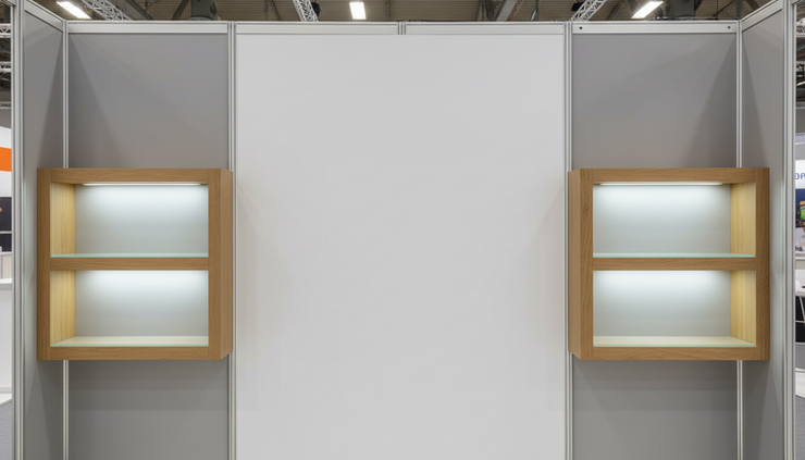
Lighting plays a crucial role in whether a small booth appears high-quality. Even ambient lighting is good, but it's not enough. Only accent lighting draws attention to products, graphics, and conversation areas.
These lighting ideas are particularly effective for rooms of 12 to 20 m²:
Accent spotlights on product surfaces
Backlit graphic areas
Indirect light on the back wall or ceiling
Warm light in the conversation area
More neutral lighting for technical exhibits or material samples
Avoid using too many different colors of light. A compact booth appears calmer when the lighting remains consistent. Blinding spotlights are also problematic, as they can cause visitors to unconsciously turn away.
Practical tip: Don't just illuminate the wall, but the point where the conversation begins. This makes the booth more accessible.
7. Only add LEDs if movement or explanation helps.
LED lighting can draw a lot of attention to a small booth. However, it's not automatically a good idea. For a booth size of 12 to 20 square meters, LED lighting should serve a clear purpose. Good reasons include:
A product is easier to explain when it is in motion.
Variants or processes must be demonstrated quickly.
The stand is located in a busy hall.
Content should be flexibly changed during the trade fair.
The back wall needs more long-range visibility.
LED lighting is less useful if it's only displaying a static graphic that would also work in print. In that case, a solid back panel is often more economical and provides a more stable look.
For small booths, large surfaces aren't the only option. An integrated screen, a narrow LED strip, or a compact LED panel can also be suitable. Distance, brightness, and content are crucial. Visitors often stand closer to the display in small spaces, so the presentation must be pleasing even from a short distance.
More information on suitable solutions can be found under LED video wall rental .
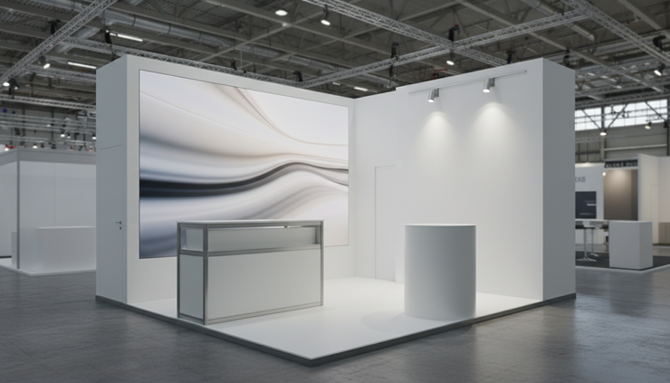
8. Choose system construction or hybrid construction based on goal, budget and reuse.
For small booths, the construction is particularly important. Every wall, every corner, and every piece of furniture must do more than just look good. It must be transportable, plannable, and economical.
Modular construction is suitable for clear, economical presentations.
Modular construction utilizes proven components and grids. This is often advantageous when the stand needs to be planned quickly, built reliably, and reused multiple times. For 12 m², modular construction can be an excellent solution because it creates order and saves money.
Custom construction is suitable for special shapes and a high degree of independence.
Custom-built booths offer more freedom in terms of shapes, materials, and special solutions. This can be advantageous in small spaces when presenting a very specific product or when the booth is intended to have a particularly distinctive look. The effort involved is usually greater.
Mixed construction combines cost-effectiveness and distinctive character.
Hybrid construction is often very attractive for spaces of 12 to 20 m². The basic structure is built from modular components, while individual elements are custom-designed. These could include a unique counter, a high-quality back wall, a lighting feature, or a product niche.
CA Messebau offers stand construction as custom-built, modular, and hybrid solutions . This allows the construction method to be adapted to the occasion, space, and budget, instead of using a one-size-fits-all solution.
9. Use guideline values, but plan the fixed price carefully.
Budgets for exhibition stands depend on many factors, including the exhibition location, stand design, construction, materials, lighting, graphics, storage, logistics, and additional technology. Therefore, general statements are only useful as a guideline.
The following examples are practical guidelines :
package | Area and zone | guideline |
Compact | 12 m², Zone A | from €5,800 |
Business | 20 m², Zone A | €9,000 |
These figures do not replace a concrete offer. However, they help to establish an initial order of magnitude. It is important that all relevant services are clarified in advance. This includes planning, design, graphics, assembly, disassembly, and any desired extras.
CA Messebau offers a free 3D visualization before you make a decision and a fixed-price guarantee. This allows you to see what's planned early on and keep costs under control.
10. Avoid the typical mistakes at small exhibition stands
Small areas are unforgiving. These mistakes occur particularly frequently:
Too many exhibits
A well-chosen selection is more effective than a crowded booth.
Too large a counter
The reception area should facilitate contact, not block space.
Lack of storage space
Visible cardboard boxes and bags make the stand look messy.
Too much text on the wall
Trade fair visitors read short statements, not long paragraphs.
No clear conversation zone
Conversations then take place in the hallway and disrupt access.
Incorrect lighting design
Without accent lighting, products appear flat and of low quality.
LED without content concept
Technology alone cannot replace a clear message.
Planning only in top view
Small stalls need to be inspected from a visitor's perspective.
The last point is crucial. A floor plan shows dimensions, but not the effect in the room. A 3D visualization is therefore not a nice extra, but a practical decision-making tool.
11. Use 3D visualization as a security check before the trade fair.
For compact exhibition stands, details matter. Is the height of the back wall correct? Does the counter appear too bulky? Is the product area clearly visible? Is there enough room to move around? These questions can be answered much more effectively in a 3D view than in a simple sketch.
3D visualization is particularly helpful for:
Sight lines from the corridor
Proportions of furniture and walls
Position of graphics
Effect of light
Integration of LEDs or screens
Storage space and wayfinding
The advantage for you: You don't make decisions based on abstract plans. You can see beforehand how the structure will look. Adjustments are easier at this stage than shortly before construction.
If you're planning for 12 to 20 m², this step is particularly worthwhile. Small changes can have a big impact.
FAQ about trade fair stand ideas for 12 to 20 m²
How much space does a reception area need at a small exhibition stand?
For a space of 12 to 20 square meters, a narrow counter with storage is usually sufficient. It should be positioned to the side and not block access. Crucially, visitors should be easily approachable.
Is a seating area of 12 m² practical?
It depends on the purpose of the trade fair. For short meetings, a standing table is often better. If longer consultations are needed, a small seating area can be useful, but it should be planned very compactly.
When does LED lighting make sense for a small booth?
LED lighting is worthwhile when movement, changing content, or processes requiring explanation need to be displayed. For purely static graphics, high-quality printed graphics are often the more stable solution.
For small booths, what is better: modular construction or hybrid construction?
Modular construction is economical and straightforward. Hybrid construction makes sense if the stand requires a special back wall, counter, or product display. For stands between 12 and 20 m², hybrid construction is often a good compromise.
Why is a 3D visualization helpful beforehand?
It shows proportions, sight lines, lighting effects, and pathways from the visitor's perspective. This allows errors to be identified before construction costs are incurred.
The next step towards a clearly planned small exhibition stand
A strong exhibition stand in a 12 to 20 m² space is created through clear priorities. Reception, product display, customer interaction, and storage all need distinct roles. Graphics and lighting must support the message. LEDs should only be used if they genuinely enhance the presentation. When considering construction methods, it's worth taking a close look at modular systems, custom-built stands, and hybrid constructions.
CA Messebau supports you from the initial idea through design and 3D visualization to the perfect stand construction . You receive a free 3D view before making your decision and a fixed-price guarantee for the agreed-upon implementation.
If you are planning a compact exhibition stand, you can request a free 3D planning consultation with a fixed price here.


Comments